Branding for a startup: Kaizenera
Finding the voice for a platform that teaches people to go freelance: three design directions, one mix, and five freelancers in under three months.
In 2019 I coordinated the branding of Kaizenera, a startup that helps people switch to freelancing and remote work. With the research done, a freelance designer offered three directions. We mixed the professional look of “The Educator” with the illustrated characters of “Coffee Wifi Success”. In under three months, at least five freelance creatives built the brand and rolled it out across web, print and social.
Location-independent work is the future of work, but we are still in the pioneering days of this new remote era. The challenge of finding the voice for a startup that wants to transform how we teach freelancing is good proof of that.
According to trends and studies, location-independent work has kept gaining traction over the last couple of years, as more and more people are lured in by the promise of financial freedom, a nomadic life and more satisfying projects. But while all this makes freelancing and remote work quite exciting, people are often afraid to make the switch and leave their traditional 9-to-5 in the rear-view mirror.
Kaizenera is an educational platform that aims to help with this switch. By the time branding came up, the project was well past its infancy: the key marketing messages, the qualitative and quantitative research, the buyer personas and the marketing plan were in their late stages, or even done. With dozens of research documents in hand, the brief could include the key findings of numerous surveys and interviews, not to mention other detailed research. So while we had a fairly good idea of what the style and voice of the brand should be, it was time to bring in a freelance designer to help create a sharp and definite voice for Kaizenera.
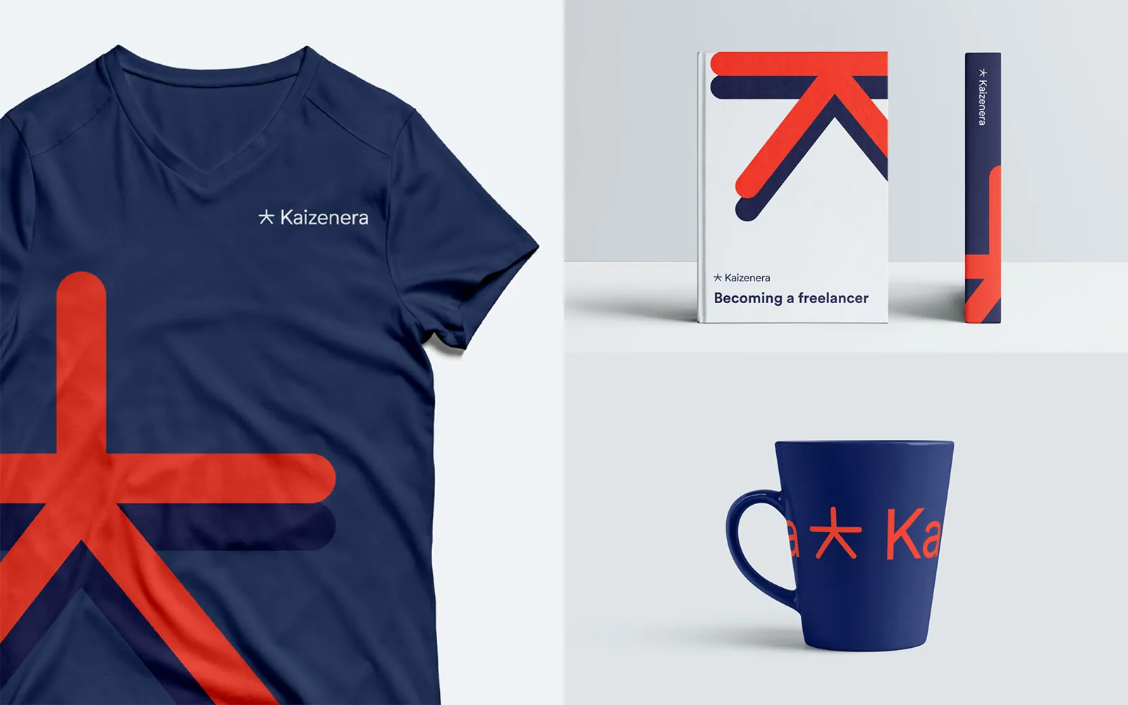
In a nutshell
The challenge. Kaizenera is an educational platform designed to make the switch to remote work and freelancing easier. The main challenge of the branding was to find a voice that represents the professionalism of remote work, while also showing the freedom it can bring.
The work:
- Market research, qualitative and quantitative
- A brand identity, created with a freelance designer
- Coordinating the brand rollout across every platform: website, print and social
Step 1: Ideation
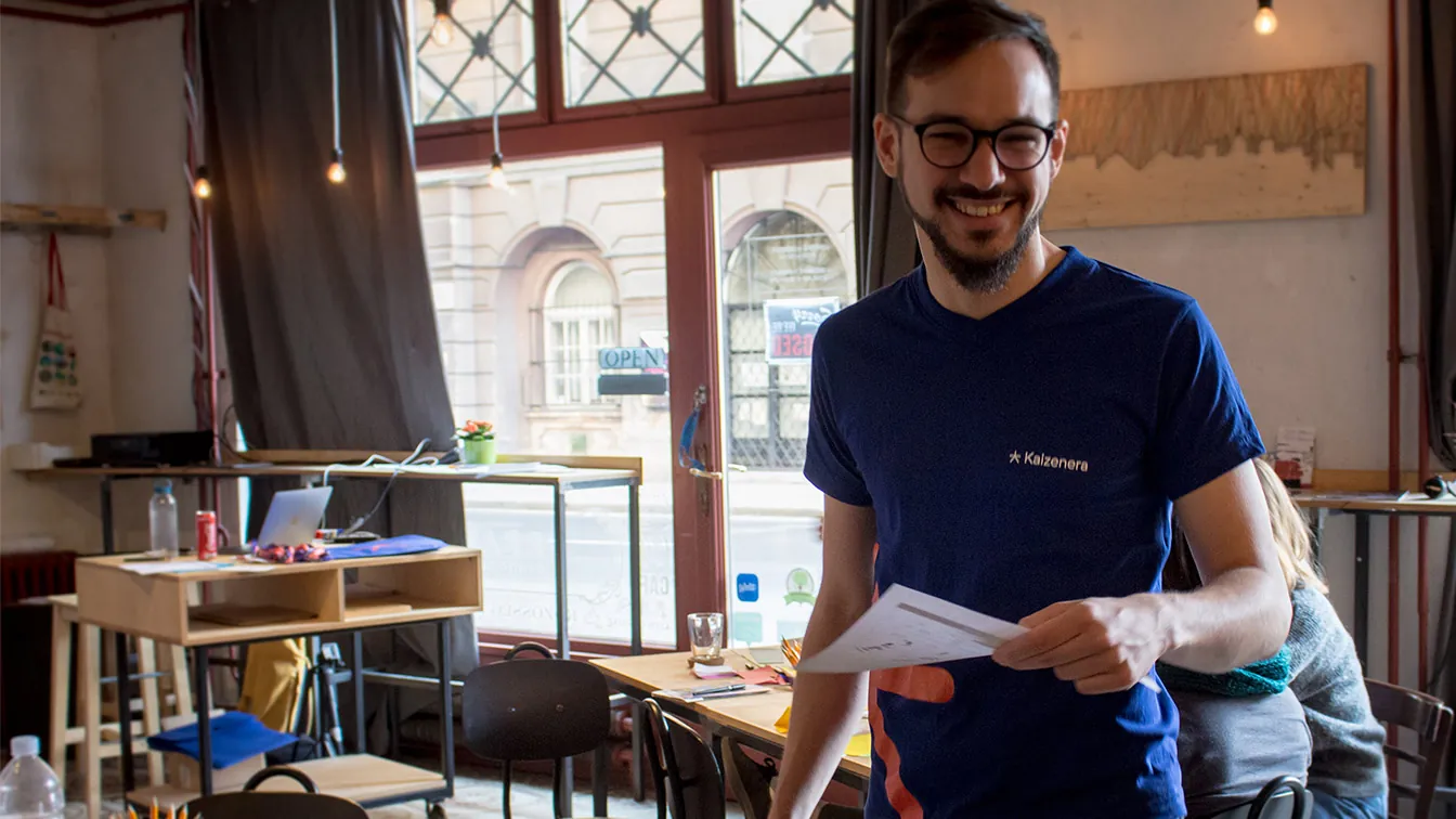
With the research in hand, the conversation between the designer and the Kaizenera team could begin. We had decided early on to bring as many freelancers into the project as possible (in fact, that is part of the startup’s business model), so our freelance designer felt right at home finding the voice of a platform built around remote work. The ideation and incubation were relatively short: a discussion of the research material, and the first mood board.
One of the most important parts of any business planning is a thorough look at the competition. For Kaizenera, it showed that most brands gravitate towards one of two themes in their messaging and identity. Either they speak to a more serious audience of soon-to-be location-independent professionals (IT developers, graphic designers), or they take a more fun approach and stress the freedom of freelancing and remote work (digital nomads, coaches, influencers).
Step 2: Evolution
Based on all the input, the designer presented three possible avenues for Kaizenera. All three resonated well with the messages and the customer thoughts from the research. It was time for the team to decide, and with every avenue this attractive, the designer did not make it an easy choice. Needless to say, when it comes to branding, this is a good problem to have. Here is a brief peek at the three directions.
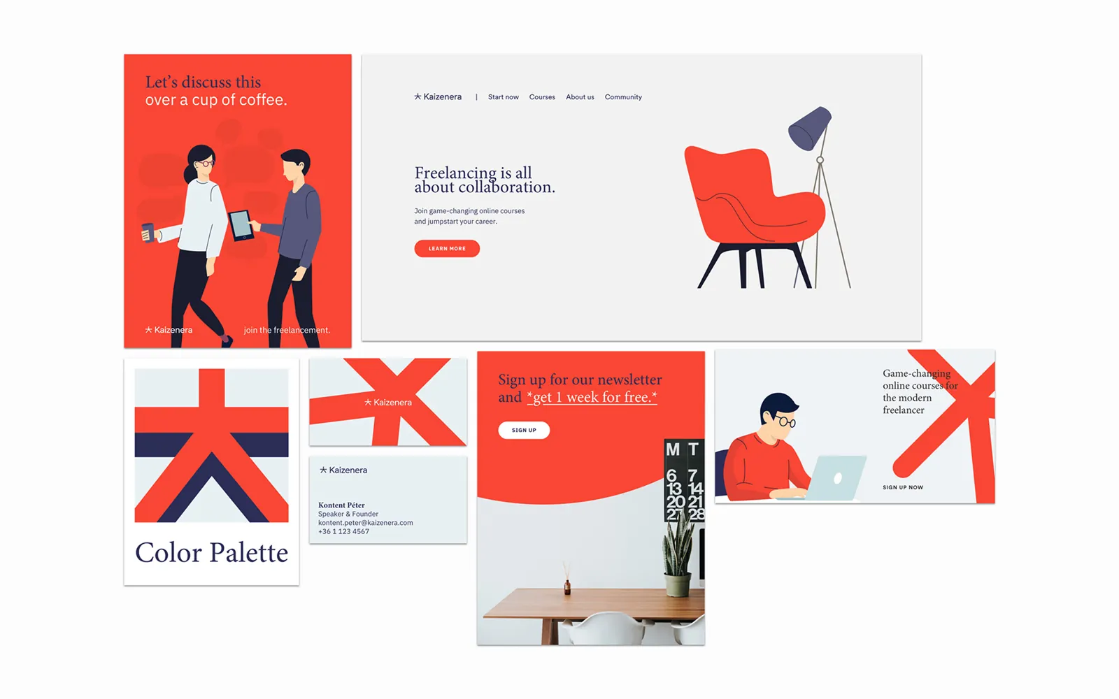
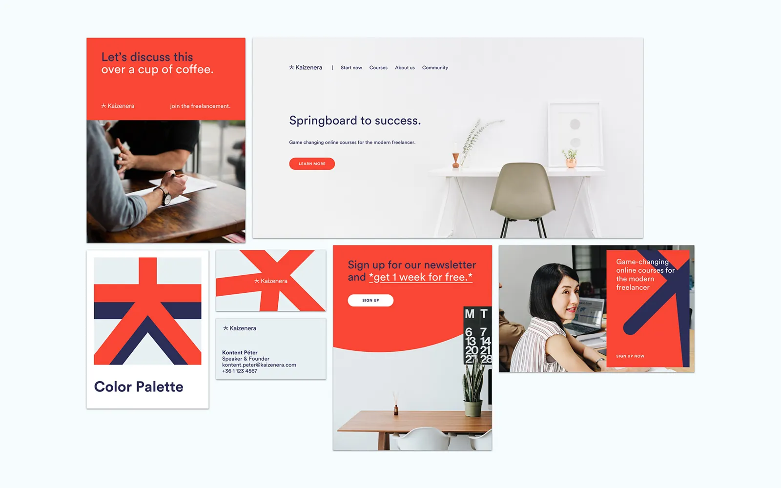
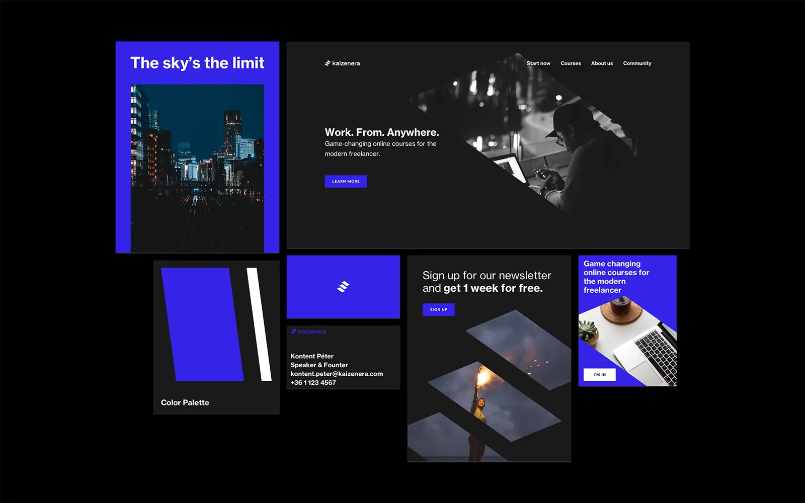
With every avenue this attractive, the designer did not make it an easy choice. When it comes to branding, this is a good problem to have.
After several discussions with key stakeholders, we decided to go with a mix of two directions, with a heavy emphasis on the second. We liked the professional nature of “The Educator”: its colours fit our aim of an atmosphere of useful, serious learning. We also liked the character illustrations, quite popular at the time, so we asked the designer whether this part of “Coffee Wifi Success” could move into “The Educator”. The mix of the two styles was an instant success, and after a brief discussion we committed. From there the process sped up: the final deliverables soon arrived, and it was time to hand them over to the in-house designers.
Step 3: Implementation
The designer did a wonderful job of creating a coherent brand book, complete with real-life use cases and best practices. The final package also held ready-to-use assets, like Google Slides templates, branded objects (keychains and the like) and a few illustrations. That brought the next challenge: how well would the existing team of freelance animators and illustrators adapt to this style?
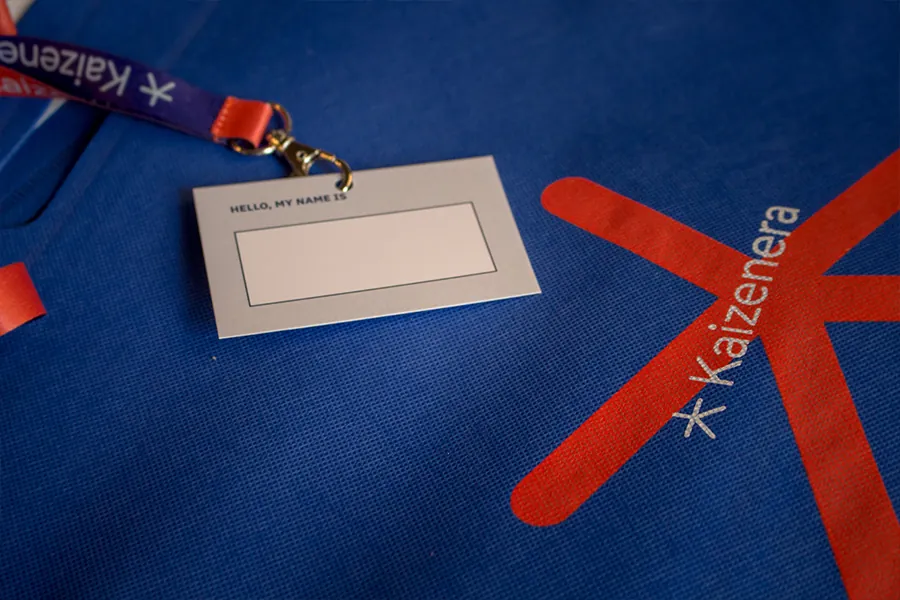
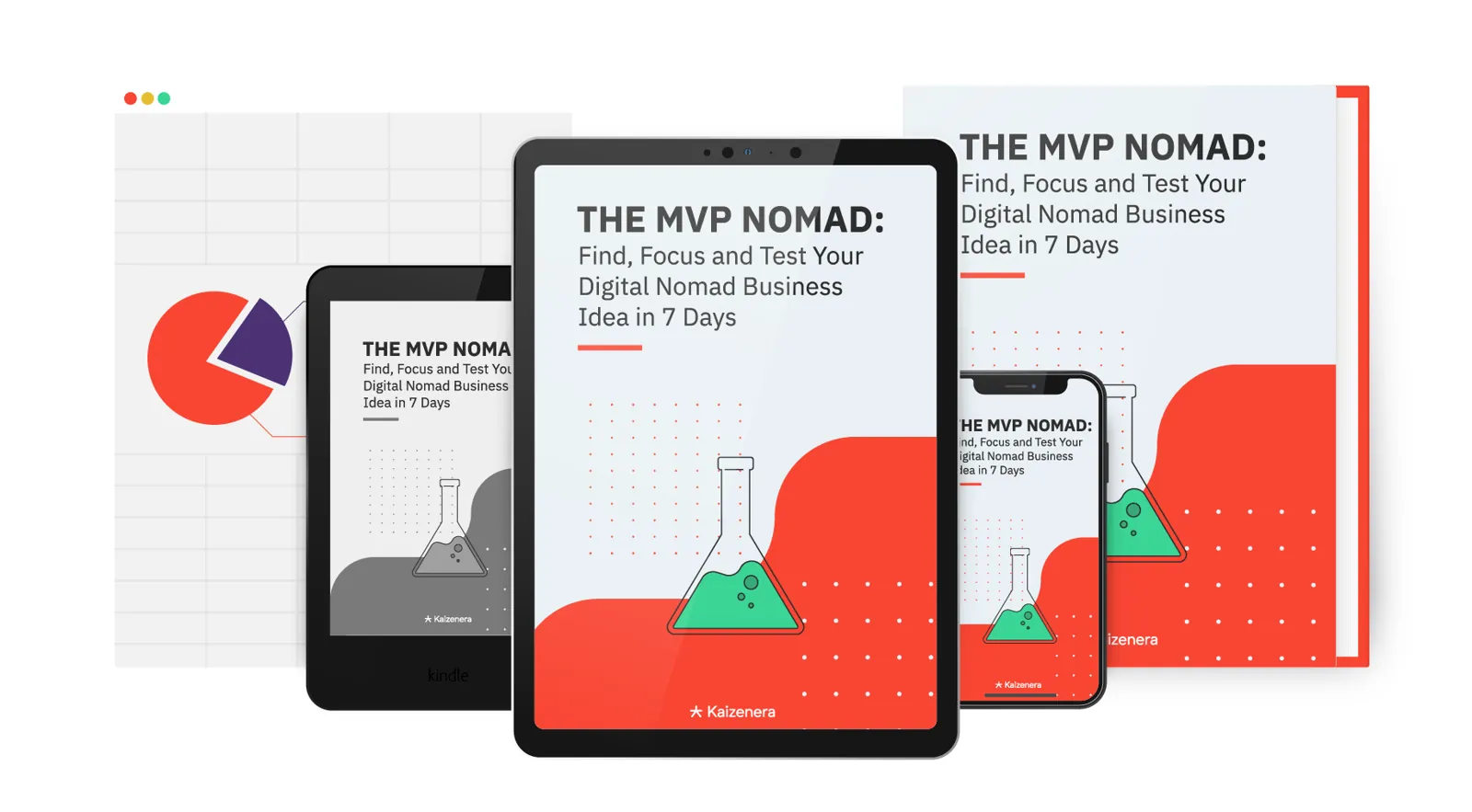
Designers are amazing at creating beautiful illustrations. But when they are handed a fixed style, like any artist, they often cannot wait to add their own interpretation. An illustrator’s own style always seeps into the work. Some art directors would call even small changes unwanted deviations, but more often they are an asset: an interpretation of, and an addition to, the original idea.
The last step of the branding was to see how well the design language would hold up in different scenarios, environments and use cases. Within weeks, Kaizenera launched its website, the social media templates were finished, the first logo animation was born, and the company had its first customers. Along the way the brand got small tweaks, and in the end, like a new house, it settled comfortably on its foundations.
The feedback was stellar: audiences often named the design as one of the main things that caught their attention.
In less than three months, at least five creative professionals worked together on the brand: creating its tone, reinterpreting its message and shaping it into an attractive offer for Kaizenera’s future customers.
Credits
- Brand identity: Robert Olah
- Logo animation: Noemi Barkoczi
Questions people ask
What is Kaizenera?
An educational platform that helps people switch to freelancing and remote work, with online courses and a community of freelancers.
What were the three brand directions?
Coffee Wifi Success, a warm community of freelancers with illustrated characters. The Educator, professional and focused on learning. The Night Owl, electric blue and black, about working on your own hours. We mixed The Educator with the illustrations of Coffee Wifi Success.
How long did the branding take, and who worked on it?
Less than three months, with at least five creative professionals: a freelance brand designer, then animators and illustrators who carried the style across the website, print and social media.
What did you learn about working with a fixed brand style?
Illustrators always bring a bit of their own style to the work. I see those small changes as an asset, an interpretation of the original idea, more than a deviation from it.